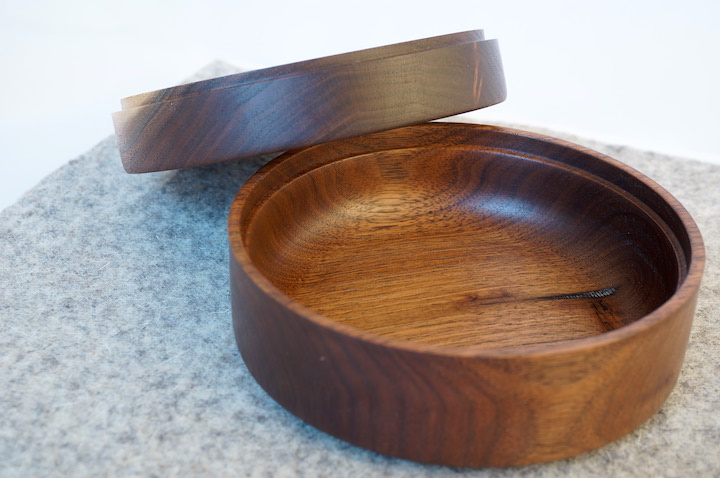
Lidded box, walnut
I turned this box one fine afternoon in a very hot July shop. I wanted something with very rectilinear exterior form, like the wooden boxes I admired when I went to weekly antiques fairs in rural England in the 90s. Those boxes were, I think, mostly Arts & Crafts-era with a few later boxes with simple Deco inlays. (They were mostly glove boxes I was admiring, because they hat neat hinges too).
To contrast with the simple rounded rectangular outside lines, I wanted an interior that was focused on touch. So, the inside focuses much more on fingertip-feel than on visual appeal. The main interior feature is a luxuriously inefficient “thumbrest” shape that perfecly fits my thumb, making the lidless bowl a joy to hold.
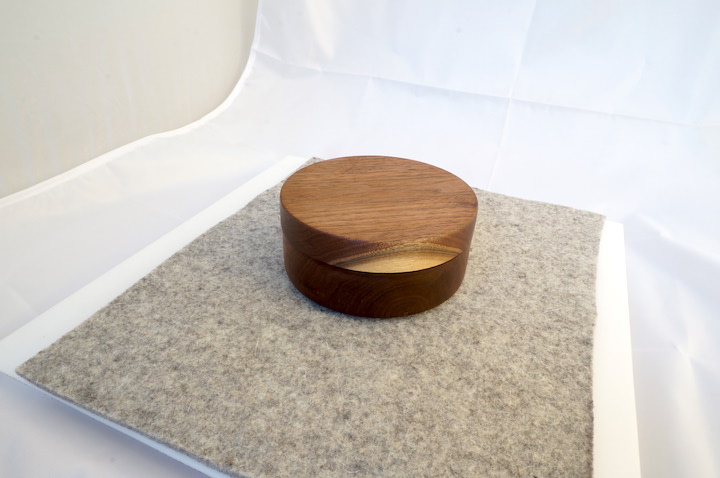
Here are some exterior shots - the asymmetrical blond spot is part of why I thought a very simple form would be best fo the outside.
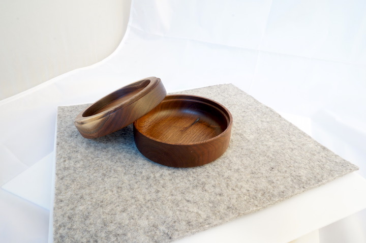
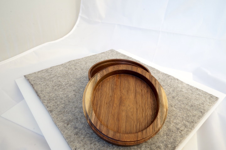
And here’s the inside, with some closeups on the thumbrest.

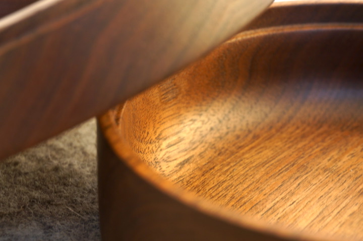
The box is a great study in forms, but fails ultimately because the fit between the lid and the box is imperfect - like many of my failed boxes, it’s possible to twist the lid and tighten/loosen it, which is a nice feature but certainly not intentional. The perfect vacuum-fit feel of a well-done box lid still eludes me - I wonder what I’m doing wrong?
I brought some more wood from my ma’s property this summer, so I’ll be working on some of those rough forms later this fall.
